Monday, 6 March 2017

TARGETS

Complete Research Tasks

The research is a vital influence to my work and I on the last week I would prefer to focus primarily on my practical work such as my turnaround and dynamic poses. As of right now the only topics I need to cover is my own research, sequential illustrations and contemporary animation, I have completed character design and historical animation.

Time Management

I have worked a lot towards my time management since the last unit but still need the extra kick with this one. I personally would have preferred to have been on to colouring my turnaround by now but I am still on the lining process and feel behind compared to the rest of the class. I have made my own personal deadline to finish up my line and colour by Monday. I will continue shading and and drawing up my colour palette before Wednesday.

Documentation

I feel that I could go more in depth with my documentation, I struggle to write about how to expand on certain subjects other than what it does and how it will benefit me. After talking over it with my piers I feel I could go further in to detail instead of writing single sentences.

Development

Development is something I don't do enough of. I have tested the different hairs, outfits and expanded on the different reasons why I feel certain things are more suitable but I haven't followed it up with the practical work. I can do more work in my sketchbook to improve on this.
Share:

Saturday, 4 March 2017

Weekly Reflection

This week I completed a full-body figure of Sorrel on illustrator. There are a few mistakes around the gun and hair but I will be moving on to fix those shortly. I decided to stick with concept two because I really liked the space bun hair, it was very fitting for an alien who resides in space. One thing I especially would like to change is the boots, I like the detail I have put in to this piece however, I feel like they take away the space vibes that surround the character and that's something I would like to keep consistent.

After some feedback I decided to keep the vegetation quite minimal in her hair because I didn't want it to look overly cluttered. I still have to get around to making a colour palette and finishing the other views on the turnaround before I start to colour.

Share:

Thursday, 2 March 2017

Development - CAAD SESSION 3 - CINEMA 4D

DIGITAL SKILLS - LEVEL 4 <--- catch up

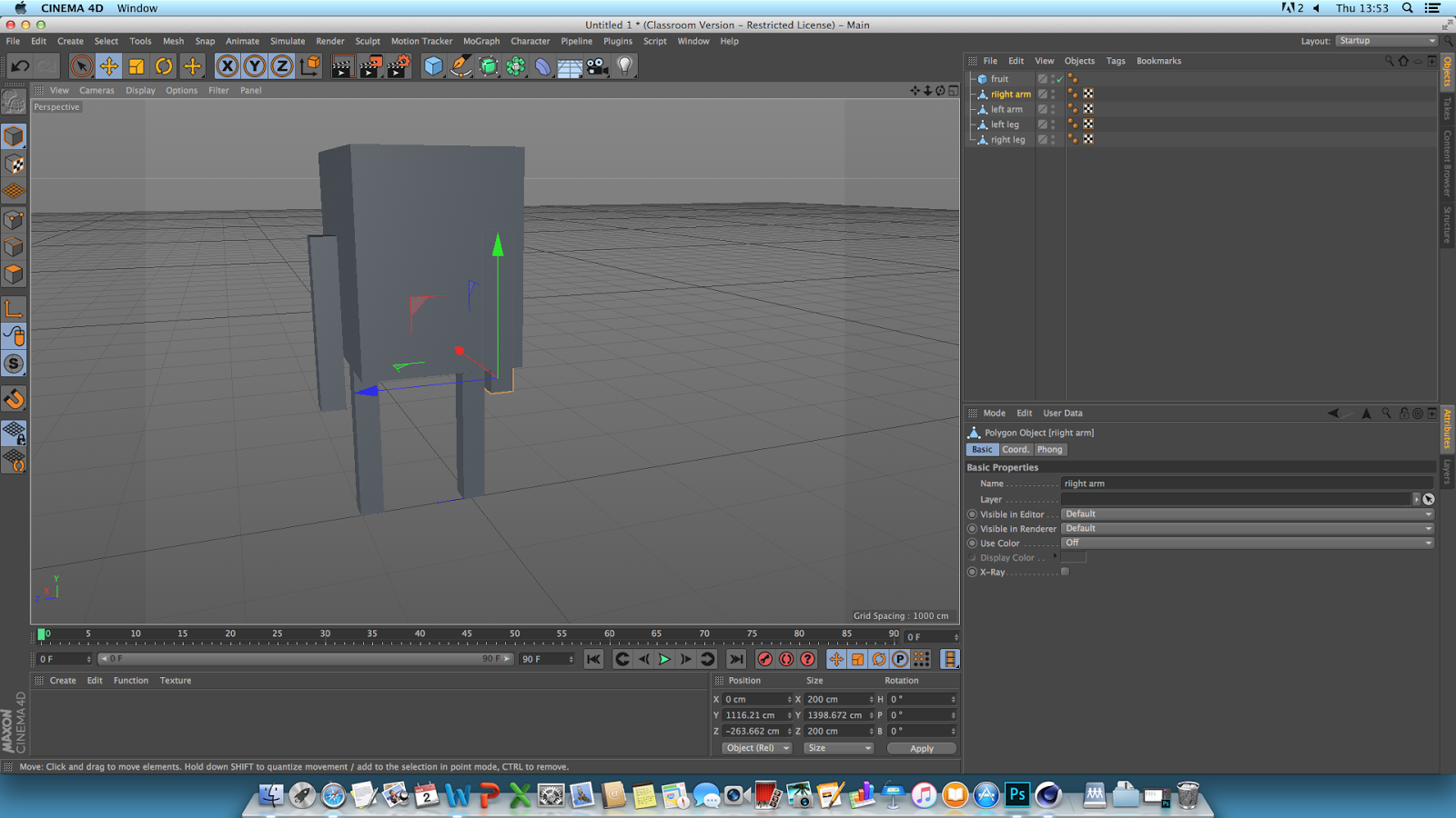
Todays session is based on character rigging. It's the last CAAD session of this module and wraps up our 3D work. We will be making a segmented character where all the limbs are separate.

Start with a cube.


Make it editable by going in to the left hand side and clicking on the top button. It should appear in the layers as a triangle in front of the cube.


Select the Polygon Selection Tool.


Changed the view by going in to the third window. Panel > View 3


Insert segaments (cuts throughout the body so certain elements bend) by selecting the top of the cube and drag it in any direction so that its being pulled out. 


Go on to model mode.


Copy and Paste the second leg and arms where you want them.


Insert another cube.


Scale the cube to make it bigger.


Make editable.


Go back in to polygon selection mode and repeat the panel 3 - extrude. Shape it with the scale tool in to a lemon(?)


Drop lemon in to subdivision nirbs.


Make a subdivision for each of the limbs.


Go in to view 3, turn off the nirbs whilst rigging, click on a limb.


 Go in to he Character tab > Joint tool, hold down control, click down the leg and apply points where the segments are.


Shift the joint layer to the top whilst you delete the 'root', place it back and create an IK chain (inverted kinematics), click on the top joint, Character tags > IK tag.


Place end joint in to end the menu option that says 'end'.


Add goal leg control.


Add pole and move the pole to where the pole to where the knee should be (forward).


Select leg, hold control and select all the joints.


Go to character > command > bind


Repeat for the rest of the limbs.


Share:

Wednesday, 1 March 2017

Character Design - Concepts and Drafts

Concept 1

I really don't like this design, or more specifically the clothes. The shirt and cargo shorts are absolutely horrendous, then to be paired with a vest hoodie feels like a crime. I liked the hair and little lavender 'antlers' but the rest feels pretty naf to me and I don't think I'll develop this idea much further.


 Concept 2

This idea was an inspired look by Melanie Martinez, a popular music artist. I really like her appearance and feel like I can apply those to this character. Especially because her looks are so 'alien', very unique and a lot of fun to work with. I think the proportions on this make her look too human. The hair is very pretty and I like all the vegetation coming out of it but the clothes are very boring. If I could alter her clothes to look like she actually comes from space. Her shoes are quite fitting and I like the bandages but I definitely have to admit that ballet shoes are not made to last given she is a traveler.

Concept 3

I do like the hair in this one, it looks very low maintenance and free spirited, which to me makes her appear closer to nature. I like all the different plants sticking out her messy hair but again, it feels more human than it does alien and I want to be able to convince the audience that although the setting is not all white, round and futuristic, it is the space age so they will have progressed to more suitable clothes, hair and shoes made to survive all types of conditions.


Concept 4

I really like this one, I based her off a more alternative look inspired by Tank Girl. She kind of looks like Kate Leth, a comic artist for Adventure Time. I really like shaved bits in the head but I'd really love to shave in some space patterns like the kind of alien circles you see in crop fields. I feel that personally she doesn't suit the plants-in-hair look so maybe I could swap it up so that she has the petals growing around her eyes. Again I feel that the clothes are not too spacey with this one and I would like to alter that. I really like the boots though, they look tough and not easily worn down.
I think my biggest complaint about this one is that she doesn't look 'delicate'. The character herself is supposed to appear very thin, almost fragile and tall. Her culture revolves around being agile and as delicate as a flower and I don't really get those vibes from this character.


Share:

Sunday, 15 January 2017

Scene 4 - ASSETS


Due to all the different rocks I included in this it was too much to make an asset list sheet. Because the environment was much closer to the mountains than previous scenes I featured much more rocks and pebbles in this scenery. I would really like to have the minotaur standing just in front of the cave and for the POV camera to reveal a sword being unsheathed as though to initiate a battle. I used a stone texture and lowered the opacity for the mountain side due to all of my brushes being really inaccurate.

Originally when I made this I forgot to change the canvas size and had to rebuild. I was going to add an extra scene showing the landscape and camera panning through the environment but after changing I saved time dragging out a separate area for the minotaur fight.


Share:

Scene 3 - ASSETS


I wasn't too impressed with myself by this scene, the blend between the fairy looking land to the stony, barren land had me struggling since I wasn't sure how to go about making the two come together. I decided on having a few bits of grass poking through the sand to give the impression the sand had buried the grass underneath. I put down a white layer in the distance and lowered the opacity to give it a thick ominous mist. Since we are now closer to the goal location I brought the mountains to scale to make them seem closer.

I intend to put more of the previously made assets such as rocks and a tree in to this piece when I begin animating in after effects which is why it looks pretty empty in this piece. The dead trees I added were to make it look even more eerie. I was really hoping to add trees with more the bare minimum amount of leaves but since all the trees I previously made were very rounded triangles I wasn't sure how to substitute it without re-designing the whole thing.

Share:

Scene 2 - ASSETS


Here's a few assets that make up the second scene and at the moment my favourite one. I made a 3-frame animation of the fairy's wings moving and to follow up, a blink animation that I haven't displayed on this sheet. Throughout the animation I wanted to keep a consistent theme of keeping everything somewhat rounded. I felt like this gave the simplicity of the animations and assets a more stylized look. For the rocks and bushes I knew I would be using them a lot in more than just this scene and didn't want it to look like a copy and paste job for every single one so made one or two extra little ones. For the tree I only made one since the majority of the animation it's going to be scaled down or in a forest squeezed in with same type so I decided to leave it be for now. I think the ground really makes this scene, the lighting is what I was most proud of as well as the tiny details like the grass overlapping on to the path and grooves in the path.

Share: