Wednesday, 17 January 2018

Digital Skills Application - Evaluation and SWOT


This unit was Digital Skill Application and I was left feeling rather disappointed with the pieces I had to present. 

This module took me up to about two weeks to really get a move on with and I felt very scatterbrained to settle on styles, approaches and workflows to how to get through my what I had. I feel as though my concentration and focus began to slip over the christmas period and and I began to fall off of my timeplan.


I feel like was very ambitious to challenge myself in an area I hadn't done before such as working traditionally, gathering and making a texture gallery however there are certain aspects of of my work that took longer than what it should have which made the digital side of my pieces appear rather rushed and lacklustre.


Whilst my sketchbook detailed problem solving and creative solutions to my how I was going to address issues in my assets I feel as though the final pieces varied in success via the individual panels. For example I feel like certain panels such as the last one appeared quite lazy and a bit of a rush job in comparison to the room which displayed a good sense of light and colour. If I had applied the same level of detail I did to the rest of the panels it would have been very easy sailing. Another point to make is the background which was just empty and boring, where it could have done with a bit of subtle pattern work to make it appear more interesting yet not eye-catching enough to distract from the main body of my work which was the separate panels of my work.


I did plan for my piece to be done in monotone I am very happy I chose to work using colours because there is more depth and an overall more established appeal about it. 


Although I really like the turn out of the scenery in the first page I feel there is a certain laziness about the decisions I made, especially regarding the grass which was made using the grass brush tool. It appears very obvious and very repetitively used making my pieces appear very unprofessional. Another point to make is my use of point-perspective when making the house is lacking the skill required, making it appear very wonky to say the least. I feel quite happy to say that whilst this was an issue I struggled with, I managed to overcome it the easy way, using assets to hide the areas for improvement.


To end on a happier note I feel fairly happy with the colour palettes which have informed research through artist influences and use of complimentary colours. Which backs up my point about being happy with my choice not to go with monotone colours.


I would like to use this unit as a learning point for briefs to come in the future and take some time to reflect upon my effort, motivation and the result of later work.

SWOT

Strengths:
  • Good standard of development and experimentation
  • Very good research in to artists
  • Informed development via research
  • Strong influences via research
  • Good decision making
Weaknesses:
  • Lazy documentation
  • Lack of skill when it comes to point-perspective
  • Limited texture gallery
  • Certain lazy aspects (grass brush)
  • Bad time management
Opportunities:
  • Spending an hour a day to do coursework
  • Learn more on point-perspective through tutorials
  • Collect free textures and magazine clippings to build texture gallery
  • Stop taking the easy way out
  • Make a realistic and achievable timeplan
Threats:
  • Leaving work until the last minute
  • Refusal to learn
  • Time management
  • Letting distractions get in the way of your focus
  • Not putting in the required effort of a HE student

Share:

Thursday, 11 January 2018

Artist Research - Junji Ito

Image result for junji ito


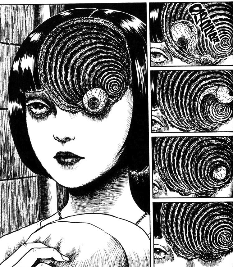
Junji Ito is a Japanese horror manga artist who has written and illustrated popular work such as The Enigma of Amigara Fault, Shiver, Uzumaki and Gyo.

From a young age Ito was inspired by both his older sister's drawing and the work of Kazuo Umezu. He first began elaborating his skills in drawing and writing as a hobby whilst working as a dental technician in the early 90's. In the late 1980's Ito submitted a short story to the Gekkan Halloween competition that won an honorable mention in the Kazuo Umezu Prize, this story was later serialized as Tomie.
Image result for junji ito

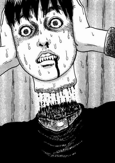
Ito was known to have many influences among his work from the likes of Hideshi Hino, Shinichi Koga and even the writings of H.P Lovecraft. Often showing interest in dark and creepy depicts of fiction. In many of his pieces his characters often find themselves to become victims of malevolent and unnatural circumstances for no discernible reason or in some cases to be punished.

Image result for junji ito

One of the more reoccurring themes in Ito's work include body horror, often displaying more graphic visuals with hair-raising carnage. When creating his pieces, Ito like many like-minded creatives starts by planning, sketching and annotating ideas on paper. A lot of his work is done traditionally using tools such as inks, brush pens and fineliners to make his work. When in the making, Ito likes to keep reference imagery above him as he works so the level of detail in his work is accurate.


Manga author Junji Ito in his studio, 2007 from Bharath M. on Vimeo.
Share:

Thursday, 16 November 2017

Juxtapoz Magazine - Review


Juxtapoz is a magazine that features an array of different genres and art types including; contemporary art, street art, graffiti, illustrative and even old master paintings. The magazine is made by people who enjoy creating art themselves and the editors have a sharp eye for quality so it's not another "anything can be art" experience. It really brings out the underground movement of the modern graffiti pop street-art you see today amongst many other mediums.

Looking through content I was enticed by some of the work of the featured artists. One of those artists being Matthew Palladino, an artist that works with painting and relief sculpture to present pop-looking three dimensional designs that regularly parody reality in content and medium. In the early years of his career during high school he was very engaged with graffiti and spray paints, creating simplistic character design such as devils, angels and sad sack faces. Although his graffiti concepts come across as quite basic I enjoy his choice of colour palette and characters.

Later throughout his career he picked up a fondness for watercolour painting where he experimented with traditional painting. He states that he has never been one for brush strokes, realistic rendering and acrylic painting but watercolour was a different story. I personally have to say that I am very keen on a lot of his watercolour pieces. The colours, themes and composition of his pieces are attractive to my tastes.


When Palladino had reached the limit of what he could do with watercolours he began to introduce fresh new mediums to experiment with such as plaster reliefs. When he started to feel like his paintings were looking flat he was eager to start bringing more form and volume to his work and started off by applying bits and pieces to his work from costumes stores and knick-knack shops to create collages. He experimented with other techniques as well such as mold-making but realised later down the road that it would be an expensive and time consuming process. He settled on plaster reliefs after experimenting with pre-made chocolate molds.


I personally find some of his molds pretty amusing and humorous. I can definitely applaud his workflow and endless efforts of experimenting but I don't think I could really find plaster relief that attractive.

Another artist that has drawn my attention is Edgar Flores, also known as Saner. A painter, street artist and illustrator who demonstrates his broad skill set particularly revolving around the theme of combining contemporary Mexican and ancient Aztec representations of local history and folklore. The subject matter almost always showcasing his awe-inspiring masks. Saner works with graphic design and applies digital techniques to his work. His digital pieces are honestly majestic and mind-blowing; the colours, style and overall appeal of the piece is stunning.


As well as graphics, Saner also has experience in traditional methods including acrylic on canvas. The style and colours are a lot more washed out with his traditional pieces but nonetheless stimulate an alluring sense of artistry - his composition, ideas and concepts are very unique.


Lastly I looked closely at Saner's wall murals, which once again are worked with acrylics. He works very closely with acrylic paints displaying his in-depth knowledge as such, I think compared to Palladino he is more settled on one medium. His designs are totally abstract and brings fresh Mexican visuals that waver between graphic design, graffiti, painting and drawing.


The final featured artist that caught my eye was the work of Adam Neate - known for his on-going series Dimensionalism, his successful practice where he demonstrates vibrant colours fused and altered around image form. As well as being a well-known street artists across and working with spray cans, aerosols and found objects, he also works with traditional paint.

His abstract and psychedelic looking pieces feature three-dimensional qualities as he works with (much similar to that of Palladino) scrap pieces of materials. Often layering these materials to make figurative images, including self-portraits and portraits of friends.


As well as these unusual and abstract pieces, Neate also has experience in traditional painting. Still as eccentric as his dimensional work but with more of a conventional and established appeal. He once stated that he goes out of his way to avoid painting on canvas, taking to carboard, walls and more to avoid the costly drawback of canvas. I definitely feel like his Dimensionalism series is some hilariously abstract stuff. Most if not all of his bizarre demeanours I've taken interest in for their surreal looking concepts. I can't say I've seen art like his before which makes him stand out of the crowd. I love it but I hate it.


I think the publication of artists like these is really great exposure and brings out just how abstract pieces of work can be conveyed and mean something deeper than it looks. I have always had conflicted views of the way social media affects artists, maybe because whilst some are very strict about how they enforce what is art, Juxtapoz exposes the movement behind painters and street artists alike.

Share:

Wednesday, 15 November 2017

Character Design and Alternative Techniques - Smart Targets

Character Design

I think there are definitely skills I would like to look back on, improve and reflect upon in future projects to come, such as:
  • Time keeping - Had I arranged my workflow and schedule better I could have avoided the rush to finish and make it look a little more worth while.
  • Reading the brief - I could have avoided such a hassle with my work had I properly read, highlighted and understood every aspect of my task.
  • Organisation - In future I would like to start organising myself better to appear more like that of a HE student.
Alternative Techniques

  • Thorough documentation - Because this unit was very experimental based and there wasn't much of a final piece it is very important to show I have an in-depth understanding of the workshops.
  • Workflow - My workflow did appear quite spotty and lacklustre throughout this project. I could have improved with a better understanding of my workflow and what managing what needed done first.
  • Confidence - I think speaking in front of peers is quite difficult for me, I speak too fast or don't go in to the details I wish I could out of nerves. I could benefit a lot from practicing speaking in front of people I trust.
Share:

Saturday, 11 November 2017

Alternative Techniques - Evaluation and SWOT

Alternative techniques is a bit more of an experimental sketchbook project covering the baseline methods to approach printing. We covered the different techniques such as lino, vinyl, press-printing, etching and more. This unit was a really fun one for me as it really broadened my skills index and I can now go on to use these techniques in the near future for other units or personal work.

I made an array of different designs for the different printing methods we used, the first one being print-pressing which I had a little bit of experience in. I decided to roll with the skulls and bones theme from last year and made my design using bird skull visuals in my work. I am very proud of this design and would love to use its designs in the near future to create tees. If I was going to make any changes to this piece I wish I had thickened up the lines so when printing it was a lot more bolder. And secondly I would have been extra cautious about the pressure I would be applying to this piece as it did crack a couple of times.


For the making of my vinyl, I was very influenced by the halloween spirit and tried my hand in designing a spell elixr. Whilst I loved the design and was very excited to try my hand in vinyl printing, I was unfortunately not in due to outside occurrences and feel that this has left me a little left out of the loop in terms of my skills. This is going to have to be something I decide to catch up on through out the week. Sadly whilst I emailed I did not include my font and therefore it had disappeared when printing. This is an issue I will be learning from when selecting fonts from my home computer.

For lino and etching I created a simple little teethy pattern to copy on to my plates. Etching was another one of my favourite practices when applying alternative techniques and whilst I unfortunately I did not take pictures of my process in the making, I did my best job in replicating my teethy design.


I think whilst I did have fun on this unit there is a lot more I could have done in the way of development, I was very inattentive during this unit and was issues outside of uni I was struggling to overcome which I feel really distracted my from progressing and showing my skills on a much bigger scale. I feel that when I started getting involved with Livetales I started to let myself slip in to another unmotivated slump. I hope that I improve on this in the future and show work more like that of a HE Student.

SWOT

Strengths:
  • An array of different techniques learned
  • Different print methods I can apply to future work
  • Up-to-date documentation
  • Pride in work
  • Previous experience helped motivate and encourage me to come out of my shell
Weaknesses:
  • Poor time management
  • Cockiness from previous experience
  • Poor decision making
  • Poor design choices
  • Allowing distractions get in the way of my work
Opportunities:
  • Make a timeplan
  • Be realistic and professional with coursework
  • Get a second opinion when it comes to decision making
  • Ask for criticism and points for improvement
  • Find a place to settle down and focus
Threats:
  • Prioritising the wrong tasks first
  • Letting distractions get in the way
  • Clamming up and not reaching out for help
  • Not listening to criticism or advice
  • Falling behind schedule
Share:

Friday, 10 November 2017

Alternative Techniques - Vinyl Process

We continued to do some of our own pattern work thumbnails until we had soaked up a bit of inspiration for the following few tasks and learned some Adobe Illustrator techniques such as using the spray can, blob brush, pathfinder and compound path to create some wacky shapes and designs. I think learning these techniques really affected the outcome of my vinyl as I did use the CAAD session techniques to create my piece.
                         

Unfortunately I was unable to attend due to outside-of-college occurrences the following week and had missed out on the vinyl cutting. But made my design and sent it over ready to be printed.

When making my vinyl I was once again influenced by the Halloween vibes, and decided to make an elixir/potion bottle. I started by gathering inspiration for it's design and appearance, looking on websites such as Pinterest, Etsy and Tumblr.


I used these three as a reference, looking at individual aspects of each of them, such as the shape of the bottle, the cork, the label and even on the last one I liked the look of the contents spilled up against the glass, it almost appeared as though the potion itself was floating in an upwards motion and helped me branch off more ideas.

I started off by making an A3 canvas at 300dpi and made a circle using the ellipse tool as well as a rounded rectangle on top.


I warped the rectangle in to an arc to make it look as though its almost wrapping around the bottle.


To me this appeared more organic and flowed much better with the style and composition.


I had to consider how I was going to make the neck of the bottle look, the general shape and size. I went for a more simple looking one so that the piece didn't look crowded. I then went on to use the pathfinder to unite the neck with the rest of the bottle.


The lip of the bottle followed the same process as the banner; apply a rounded rectangle and warp it in to a slight arc. I could now move on to more specific details such as the cork, lines and the tips of the banner. All for which I used the pen tool. The cork I impromptu decided to change it to look like the end of a bone, giving it a little extra creepiness. This had brought an end to the general overall shape of the bottle which meant all there was left to do was to touch up the little details and add my type.


For the lines I went around changing the weight, opacity and profile in the stroke options so they did not look so stiff. 


Which meant the last thing there was to do was to fill the bottle with its contents and put my type on the banner. I used to blob brush while reflecting back on the previous CAAD session to fill in and round off the liquid. Inspired by my research in to the three references I gathered I wanted to make my contents look as though it was floating and bubbling upwards, giving it an 'eerie magic look'. The type I placed over my banner felt very fitting of the piece. Looking as though the bottle contained this 'Black Magic' in liquid form. I applied highlights around the bottle where the liquid was to give it a little more depth in its shape.

Finally to round off the design I added little stars on the inside to add a little more of a 'magical' appeal to it.

Et Voila!

Share:

Alternative Techniques - Print-Pressing Process

Fortunately I already had a bit of experience on from the previous year on print-pressing so could organise myself accordingly to how I remember. I started by making a 20x20cm canvas to work on, and traced over some bird skulls on Adobe Photoshop using my Wacom tablet.


I had originally planned on doing just the one skull but later found that it looked quite barren and empty, so filled it up with a couple more skulls before putting it in to Illustrator.


Using the ellipse tool I placed a circle around the skulls and turned the fill off. I thought this would bring the piece together as a whole when printing on paper, rather than having three skulls looking quite barren on the page.
When actually doing the press-printing we worked in two separate groups before and after lunch time. Myself being in the slot before lunch meant myself and a couple others were the first to run in to some of the blunders that unfolded. For a select few people who's designs had very fine lines, the ink would struggle to pick up, meaning we would be tightening and loosening the roller a bit. Unfortunately when we tightened it enough for the ink to pick up this, it would be too tight and some times crack or snap the plate. This happened a couple of times on my plate and I had to glue some pieces back together and get some sandpaper on the job.


Once we had gotten past all the small technicalities though I found it to be very rewarding and loved the turnout of my prints.


Share: