Wednesday, 16 May 2018

Personal and Professional Development - Evaluation and SWOT

PPD has been one of the harder modules for me and has showed some lack of understanding.

When I was first met with the brief, I was under the impression we had the bare minimum to do for this unit (creative cv, business cards and powerpoint). But it was not until the last minute I had been made aware that we had to have a whole file documenting our findings to submit. I feel like I have been very sheepish about many aspects of this file, often looking around to see what other people were doing before taking my own initiative and being my own person.

Due to a lack of time and pressure to get the job done, I went ahead and printed pdf's of web pages as part of my research in to local and national companies, I feel like this shows very obviously my press for time and an 'easy way out' of getting it finished and out the way.

My individual learning plan was absolutely naff, extremely limited and last minute, showing next to no effort put in. With zero introduction or conclusion it was hard to even tell that it was a learning plan other than the title of the page which I can say I am humiliated to have handed in.

My business cards are alright and are fit for purpose but are designed with minimal effort and bad design choices, for example, the box around 'illustrator' was a rushed and last minute bad decision that I regretted as soon as they were printed.

My cover letter is jam-packed with a whole load of unnecessary waffle that would probably bore the eyes off of any future employers. Its incredibly long-winded and I feel as though there is a lot I could have done to summarise myself.

And I save the best til last, my CV. For the majority of this unit, planning and constructing my creative CV was the fun side of this. Because I've had experience in the past with creative CV's I made note of how the pros and cons of my last one and made it quite clear on this one exactly how I wanted it. When comparing my old one to my new one I would hardly believe that is what I was able to get away with in the past. When making my CV I aimed to make it as visual as possible whilst still retaining important information. I think the main changes I would have liked to make was possibly adding a little more eye-catching colours instead of the boring black and white but I stuck with my goth themes.

In conclusion to the file in whole, I definitely feel like there’s room for improvements, especially in regards to my research, skills analysis and individual learning plan. I will be looking to find solutions to misunderstandings like this in the future with a lot more urgency and detail. I hope to prove myself a lot smarter about issues like this in future and have to confidence to discuss them with my tutor.

SWOT


Strengths:
  • Very informative and professional CV
  • Research detailing several companies listed
  • Research in to competitions and live briefs
  • Very informative and colourful business cards
  • In-depth cover letter
Weaknesses:
  • Lack of understanding the tasks of the brief
  • Very poor time management to get tasks done
  • Very effortless write-ups
  • Very poor and last minute decision making
  • Lack of urgency to get the job done
Opportunities:
  • Catch ups with tutor to elaborate on misunderstandings
  • Realistic timeplan
  • Spending an hour doing coursework a day
  • Look for second opinions before making big decisions
  • Look up motivational speakers for inspiration to do coursework
Threats:
  • Not making an effort to overcome issues
  • Making an unrealistic and hard to follow timeplan
  • Letting distractions get in the way of work
  • Refusing to understand and looking for the easy way out
  • Generally running from fears instead of facing them


Share:

Tuesday, 15 May 2018

Commercial - Evaluation and SWOT

The work I have produced for this module has been lacking severely over length of time i've had for it.

Required for this brief was an A3 printed portfolio, a photobook (from either Blurb or Vistaprint) and a pdf of our portfolios, portfolio commentary and evaluations.

For my A3 portfolio, I did not print on the quality of paper that I should have, making it appear very lacklustre and quite subpar. I think I have managed to scrape the bare minimum with my portfolio, displaying some of the pieces I did not want to represent me. Another point to make is that many of the pieces included in my portfolio appear quite pixelated which has further lowered the quality overall and making it look cheap and not that of a HE student.

I took a lot of time work on my photobook before I sent it off to print as I wanted to polish off older pieces and make some new ones, especially to appear more professional and orderly. However, since coming back from Berlin I had still not sent it off, leaving not a lot of time before the estimated due date of arrival. I chose to go with an A4 book as this is my first time making and ordering one, so whilst square did look nice for displaying certain pieces, a lot of my work is done on A4 - A3 portraits, so making the fit in to my book would have been tricky.

For the pdf file of my portfolio, I struggled to print them in university. I was told that if I select them, go in to print and print them as a pdf it would be as easy as that but unfortunately I was unable to print them all as one pdf file as it would only offer to turn the first selected image in to a single pdf. When I eventually did get around to doing my portfolio, it was not in order and looked extremely underwhelming.

I did not get around to doing my portfolio commentary as I should have due to time limits and restrictions. I had left my portfolio commentary up until the last minute and failed to complete it before it was time to hand in, this is a very poor standard of work to be handing in and I am to blame for my own shortcomings.

I feel as though I have handled this unit as well as PPD and Work-Based Learning very poorly since getting back from Berlin, making very poor choices and showing very little effort amongst my work. This is a very crucial and important time to be making these kind of mistakes and it is regrettable to say in the least. I desperately need to get my shit together before going in to the third and final year and will be reflecting on this period to get a better hold of myself and how I stay focused.

SWOT


Strengths:
  • 25+ pages in my portfolio and photobook
  • Polishing and renewing old pieces
  • Progression of new techniques
  • Understanding tasks and what to prioritise
  • Problem solving issues involving finance
Weaknesses:
  • Terrible focus to stay on task
  • Poor quality of paper to print on
  • Poor time management
  • Missing vital coursework
  • Lack of self-awareness
Opportunities:
  • Make a timeplan
  • Write up a check list beside timeplan
  • Find a quiet place where no distractions can cut in to coursework
  • Work for an hour every day until the deadline
  • Check in with tutor and classmates to see where you should be up to
Threats:
  • Not attending classes to receive important information regarding brief
  • Setting unachievable targets and timeplans
  • Not investing in quality
  • Making a habit out of failure
  • Not working towards improvement


Share:

Tuesday, 8 May 2018

Weekly Reflection - 08/05/18


I have not long returned from my trip to Berlin to visit the Pictoplasma Festival 2018!

It has been an amazing week experiencing the colourful and gorgeous city of Berlin, going around the character walk and speaking to much admired artists. Because I have seen and done so much in the space of a week I have decided to summarise each day in to paragraphs to make it easier.

01/05/18 - Day One

On day one we all met up at the airport to get ready to fly out, because the flight was didn't arrive until after 10pm in Berlin there wasn't too much of a rush (until we were paying for our meals and running for our plane). 


When we arrived in Berlin, we went straight to the coach which took us to our hostel. This was just a settling-in night in comparison to what was to come so whilst uneventful in the way of art and illustration, there was plenty of excitement amongst the class and we had a sit-in night with a few drinks.


02/05/18 - Day Two

The second day was very informative and gave us all the chance to get-to-know the city, getting to know how the trains work, and being given free reign to wander without restrictions. I had fun being a tourist and getting to see all the attractions. 


After a little look around the city, we all met up to go to Urban Spree which exhibited artwork from contributing artists and had stalls where merch such as clothing and artist prints were up for sale. 


During the evening we attended the Pictoplasma Opening Party that had an array of different things to see, one of the highlights being the staredown room, a reference to the recent call for entries the Character Staredown. 


After a long and expensive day we made our way back to the hostel to prep for the following day.

03/05/18 - Day Three


On the third day myself and several others in my class were determined to go visit a local store known as The Dudes where everyone managed to get a hold on some high quality and gorgeously designed tees.


After our adventure to the Dudes Factory we decided to have a little chill time and doodle in a park whilst the sun was out.


04/05/18 - Day Four

On the fourth day myself and my class were on a mission to conclude this trip by going around the character walk in a day.

One of the first exhibitions we had a look at was Moomins. The Moomins are a family of white and roundish trolls with large snouts created by the illustrator, writer, and artist Tove Jansson (1914-2001). Keeping the heritage and the original Moomin artwork alive, one of the latest projects has been the animation feature film ‘Moomins on the Riviera,’ created by Xavier Picard in 2014 and based on the comic strips by Tove and her younger brother Lars. This exhibition showcases original pencil drawings and scenes from the experimental animated family comedy.


Next on our walk was Lunartik otherwise known as Matt Jones, a multi-media artist renown for his collectible series of ‘Lunartik in a Cup of Tea.’ Pop along for an eye-full of designer vinyl art toys and a chance to meet Matt himself, the man behind the cup! I was especially drawn to his Beatles figurines but could not coax myself in to buying one. 


And one of my favourite exhibitions was set just as you enter a graveyard on Verwalterhaus. Which displayed work from several artists such as Victor Castillo, a Chilean artist presents a series of new paintings created especially for the festival. They explore the laws of the jungle and the age-old story of ‘man eats man.’ Inspired by vintage animation, Castillo’s paintings are like theatrical sketches of tragicomic scenarios. With cartoon-like figures foregrounded against classical landscapes, Castillo’s baroque lighting completes the dramatic effect of exposing lost innocence.

Castillo has definitely been one of my far favourites out of the few we seen. His work inspired me on a whole other level and the setting of the exhibition was too perfect.


Within the same exhibit was the work of Moki, an artist and illustrator who blurs the lines between the mental and the physical, allowing for the creation of a series of unique spaces of sanctuary, protection and solace. A sophisticated painterly skill is employed to give a staggering degree of reality to her paintings, no matter how fantastical the content may be. However, more recently Moki has been veering away from unreality, instead drawing inspiration from the seemingly endless sources of concern for the well being of many of planet earth’s creatures, including much of humanity. In her new comic novel, ‘Swamp Land,’ the artist Moki tries to picture this complexity, weaving stories into one other, both mysterious and visionary. This exhibition further explores the cosmos of ‘Swamp Land.’


Next on our travels was another amazing exhibition at Neurotitan which displayed the work two of my favourite artists Kévin Gemin and James Curran as well as another two talented illustrators/animators Jim Stoten and Cachetejack. 

Although he goes by Kévin, he is very popularly known as Kéké. He is a 2D animator and illustrator and a big fan of animals, so much so that they inspre him to create stories and short animated GIFs to share happiness and fun. He animates with the application known as Flipnote Studio on a Nintendo handheld gaming system (such as 3DS and DSi) which has enabled him to teach himself how to animate and experiment with the pixel effects.

                                           Image result for kevin gemin pictoplasma

As a long time, loving fan of Kéké's I was very inspired to make little doodles along the way on our character walk so I made a simple little doodle page of all his characters that represent him. I was going to give it to him in person but unfortunately did not go to his conference as I couldn't afford the tickets. I decided to leave them at his exhibit for him but due to the restrictions on taking pictures in the exhibition I don't expect it to go very far.


My second favourite illustrator and animator is James Curran who made work towards his Gifathons. He spends 30 days in a different city making a short looping animation each day based on his experiences during his stay, from strip clubs, to tacos and toilets. For this first Gifathon exhibition, all 90 animations made in New York, Los Angeles, and Tokyo will be shown together along with a brand new mini-Gifathon on seven days spent in Berlin, created especially for Pictoplasma.

                           Image result for james curran pictoplasma neurotitan

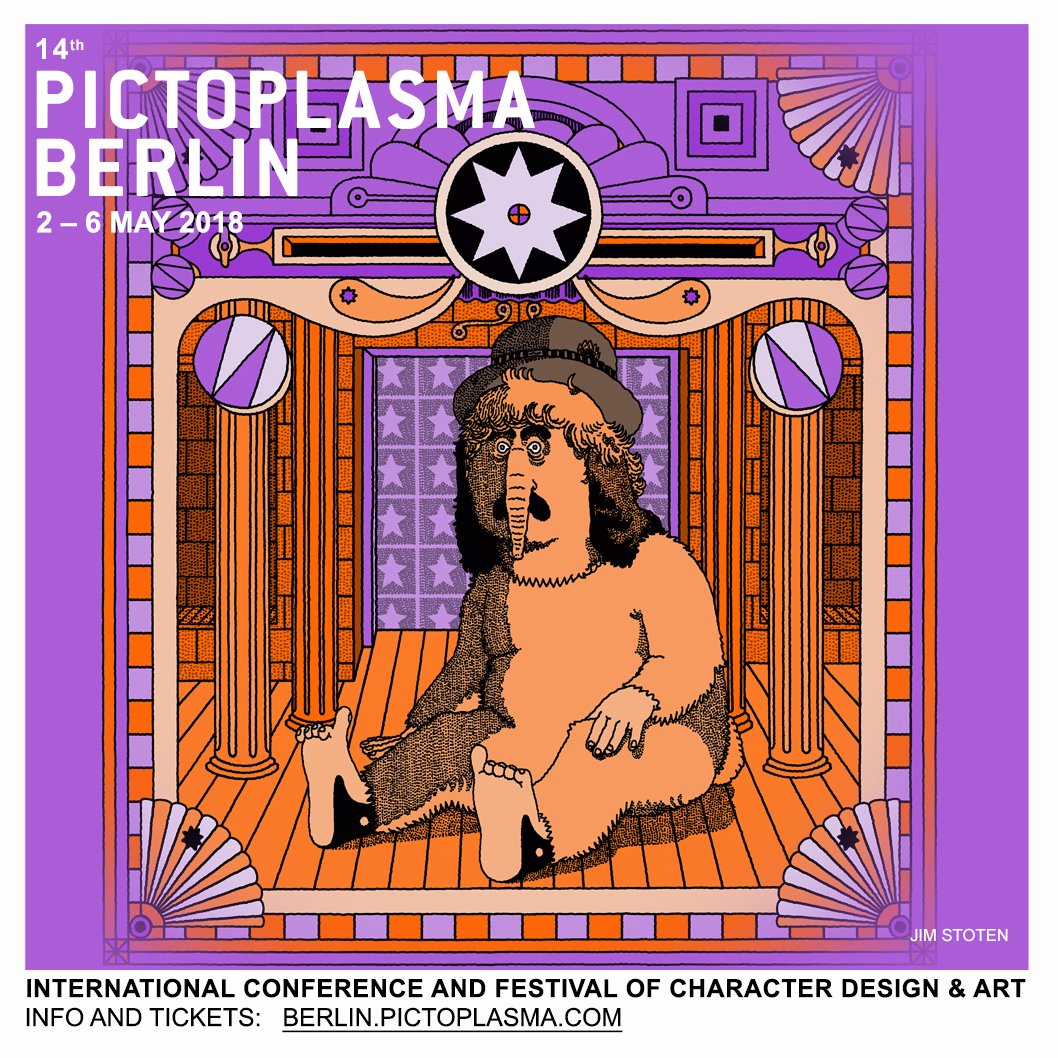
In the same building was Jim Stoten, an artist and illustrator living in Hastings. He produces work for a long list of clients and pushes his creative boundaries in personal projects, exploring painting, animation, collage, and music.

                                          Image result for Jim stoten pictoplasma

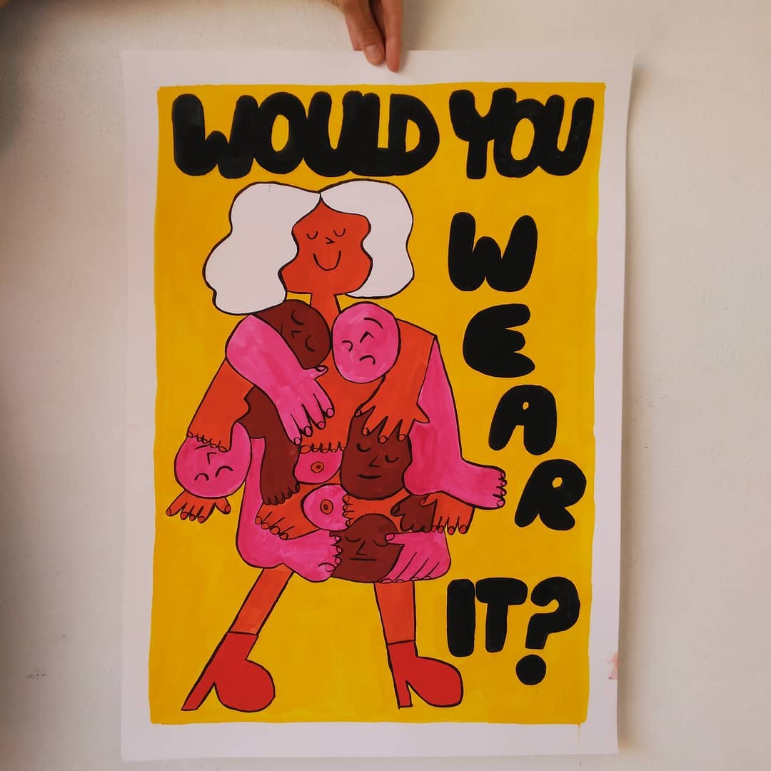
And finally, to conclude our character walk was the work of Cachetejack, a Spanish illustrator duo presents a series of new gouache works on paper and silkscreen prints. Their illustration universe is full of colors, energy, humour and irony. The hand drawn work of Cachetejack takes a fresh and unique style working in a variety of mediums, including—but not limited to—books, magazines, newspapers, clothing, drawing, painting, walls and illustration. Cachetejack combines reality with a quirky point of view to create situations and environments closer to the viewer.

                                         Image result for cachetejack pictoplasma

After a long and tiresome day of walking around the city of Berlin, our class went for a final dinner together before a couple drinks and wind down.

05/05/18 - Day Five (The Last Day)

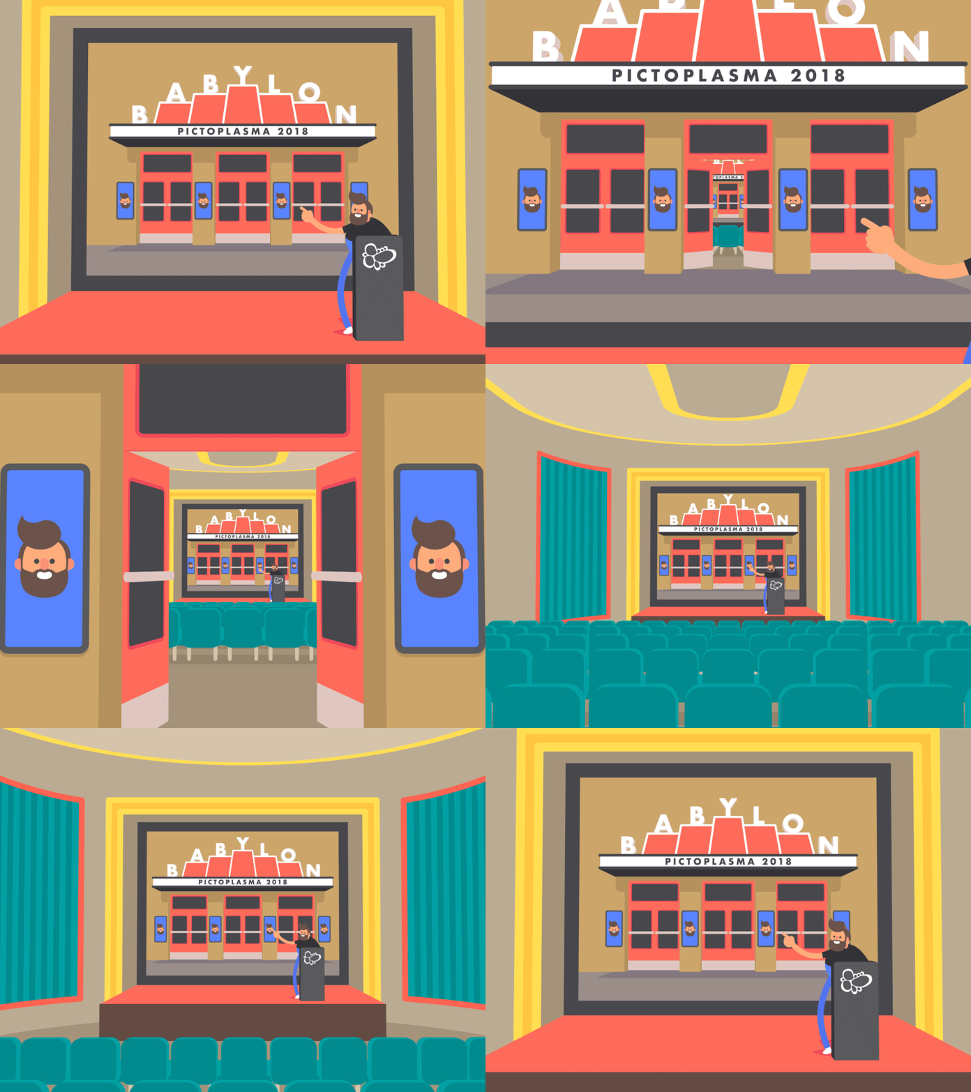
The last day was a very mellow and relaxed day, we were up early for breakfast and to clean out our rooms. We made an early trip to Babylon to pick up some very pretty merch and were even given free posters.

                              Image result for babylon pictoplasma

After our return from Babylon, all that was left was to wait around on our coach to the airport and hop on our flight. I found this to be the worst part of the trip as there was a lot of waiting to get out of a place I didn't wanted to leave. I absolutely love Berlin, it's been an amazing experience meeting all the amazing like-minded creatives visiting the festival from abroad and exhibiting. I am also incredibly lucky to have been surrounded by the amazing people residing in my class who were excellent company to have on my travels. I will definitely be back next year and look forward to seeing what's in store.


Share:

Saturday, 14 April 2018

Work-Based Learning - Evaluation and SWOT

This unit has been very enjoyable and has given me amazing opportunities to work under several like-minded creatives in workshops that have since informed me about their experiences since leaving university and what I should expect when going in to the industry.

Over the last month or so I have been actively taking part in workshops and contributing to competitions hosted by Pictoplasma and the Cheltenham Illustration Awards, making pieces based on themes arranged by both sites. These competitions have been very open to artist interpretation and I have therefore had lots of freedom to come up with my own ideas for my entries based around the chosen theme.

For the workshops I took part in I had a very enjoyable time learning about the different backgrounds of some very talented artists. But when it came to actually writing up my summaries and getting something out of the workshops I found that there was a certain laziness about it.

For the zine workshop - I failed to take pictures and to present the step-by-step process made in the session, making it unclear as to how I got from point A to point B, and did not go in to further details about why. I was also unable to attend the first workshop hosted by Midnight Gifts which is a bit of a shame as I would have really enjoyed learning more about him and his creative process. For other workshops hosted by Laura Sheldon and Livetales, there was a considerable amount of detail and visuals to go with which I should have really shown in all workshops.

The competitions and live briefs we took part in were a lot of fun and fairly straight forward to get an idea of what needed to be done.

Starting with Pictoplasma's Rabbits Reloaded:


The brief for this unit to create a rabbit of my own choosing and submit it on to the Pictoplasma website. I had many different scribblings in my sketchbook of what I could possibly develop further on a digital format but narrowed it down to four rabbits. I was quite proud of the work I produced for this and found it to be very straight forward with no research requirements (aside from the minimal amount I did on how to actually draw rabbit proportions).


I felt like out of the four produced that the last one was the most unique and gave the character a bit more character compared to the rest and decided to make her my rabbit for entry.


I feel that for this competition my development was not nearly as limited as it has been for my Tangled Tales entries:


Whilst I did enjoy working to make something for the Cheltenham Illustration Awards, I feel that the lack of development and experimentation made towards the final pieces hindered some more diverse looking outcomes. I think it is the development during this competition that has really let me down, giving very half-assed documentation to even detail choices (or the lack of them). Limited research was also an underlying issue of why my experimentation and development has been very unprofessional and lastly the distractions from outside college that I did not address sooner. 


Artists researched were Vince Low and Nester Fomentera who both display some very intricate and unique approaches to their linework. I only did one experiment with Formentera's style before I decided to call quits on pursuing a style like his.


When printed, I noticed that all three final pieces were giving off some very obvious pixelation that I had not even noticed during the making. Because I did not notice during the process I cannot answer why this occurred or where the pixelation came from during this time but it is my own fault for not going back and fixing these errors as soon as I seen them but instead left them appearing extremely unflattering.

Had I approached Tangled Tales with the same enthusiasm as I had for the Rabbits Reloaded I would have made something I could be proud of for once.

In conclusion, I found this unit very enjoyable and very informative. Getting a glimpse of the outside world via other peoples backgrounds really spurred on a new motivation and excitement for me to get out in to the real world and start making something of myself, however, I feel that this excitement and drive needs to be shown in my coursework first. 

SWOT

Strengths:
  • Attended all but one of the workshops
  • Completed write-ups summarising workshops
  • Various concepts and ideas for Rabbits Reloaded
  • Submitted to both competitions
  • Learned how to use the riso
  • Learned how to make a small zine
Weaknesses:
  • Very effortless approach to Tangled Tales
  • Next to no development for Tangled Tales
  • Very limited research for Tangled Tales
  • Very poor documentation overall
  • Very poor standard of work overall
Opportunities:
  • Making a realistic timeplan
  • Spend an hour a day doing coursework as soon as issued the brief
  • Take more pictures throughout workshops and lessons for documentation
  • Using spider diagrams to branch out more ideas and artist influences
  • Find a special time to update all social media to update
Threats:
  • Poor time management
  • Poor documentation to show I completed a task
  • Lack of development and experimentation
  • Lack of research to influence development
  • Lack of communication and confidence to tell tutor when struggling
Share:

Artist Research - Nastya Melavia

Image result for Nastya Melavia

Nastya Melavia is a ceramic artist based in Khabarovsk, a city on the Amur River in southeastern Russia.

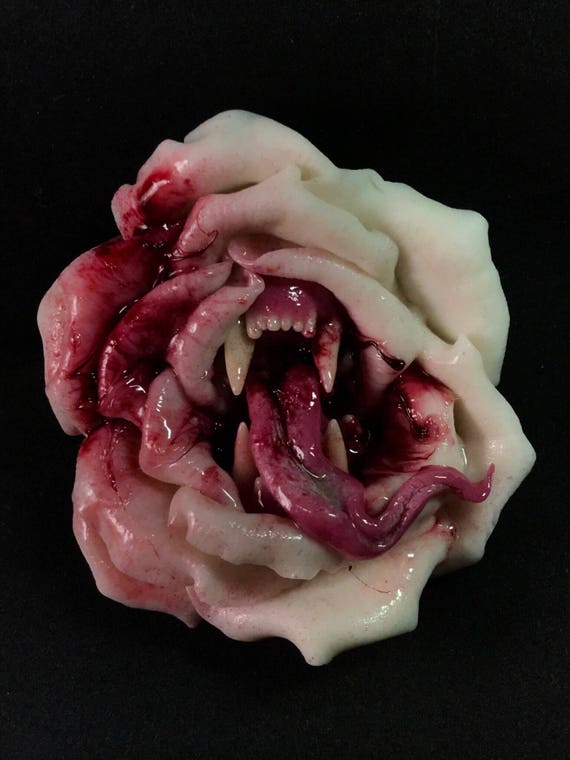
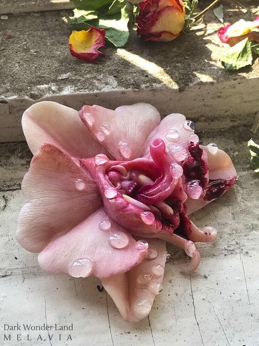
Melavia runs a shop on Etsy that features an array of extravagant decorations for people. She uses polymer clay, plastic suede, precious stones and more to create miniature and one of a kind designs, a lot of which exhibit floristry with a side of horror. The most common running theme in and about her shop is making floral pieces with certain obscure and sometimes obscene features.

Image result for NBmelavia

Some of the items displayed on the shop include broaches, necklaces, pendants, hair pieces and more. 

When planning her work, Melavia starts with initial sketches and posts her progresses on her Instagram.


Once planned she moves on to the making process of sculpting the pieces with polymer clay.


And later brushes up with paints, applying significant detail on the areas that require.


You can find and follow more of Melavia's work on her Instagram where she updates regularly with ideas and concepts, processes and finished pieces ready to be sold on her Etsy.


Share:

Tuesday, 27 March 2018

Work-Based Learning, Personal and Professional Development and Commercial - Smart Targets

Work-Based Learning

  • Attend and document workshops
  • Research words relating to 'Tangled Tales'
  • Draw a minimum of ten rabbits for Rabbits Reloaded

Personal, Professional Development

  • Make headway on business cards and creative CV
  • Ready powerpoint detailing skills analysis

Commercial

  • Buy a portfolio for A3 pieces
  • Arrange and send off photobook
Share:

Friday, 23 March 2018

Artist Research - Natasha Allegri

Image result for natasha allegri art

Natasha Allegri is an American storyboard artist, storyboard revisionist and comic book artist, but is best known for her work as a storyboard revisionist for Cartoon Network's Adventure Time and as the creator of Frederator Studio's Bee and Puppycat.

Image result for bee and puppycat storyboard

Allegri met Pendleton Ward, creator of Adventure Time during her high school and college years when she used to make comics about her day-to-day life on LiveJournal. Ward, who also used LiveJournal had taken a like to her work and contacted her about working on his show Adventure Time where she has worked for five seasons. Whilst working on the show Allegri liked to play around with the idea of gender-swapping characters where these were eventually featured in full episodes.

Image result for natasha allegri art

In 2013, Allegri produced an animated short for Frederator Studio's youtube channel, Cartoon Hangover. The show follows the story of a young, unemployed woman who is met with a strange and magic creature resembling both a dog and a cat, Puppycat. When she decides to take him in she makes an unlikely discovery that he is able to conjure temp jobs from outer space and together they go on wild and otherworldly adventures. 

Image result for bee and puppycat

After the show gained popularity and following, Frederator launched a kickstarter to raise funds for a season. The fundraiser was successful and exceeded their original goal of $600, 000 and were able to raise a ground breaking $872, 133, making them the 4th most funded video and film project to date.

Related image

Many artists who have inspired Allegri's work include work by Sailor Moon, Superbook and Bob's burgers. Another important source of inspiration for Allegri has been her cat, Pancake.
Share: