Thursday, 15 February 2018

Artist Research - Matt Bailey


Image result for matt bailey


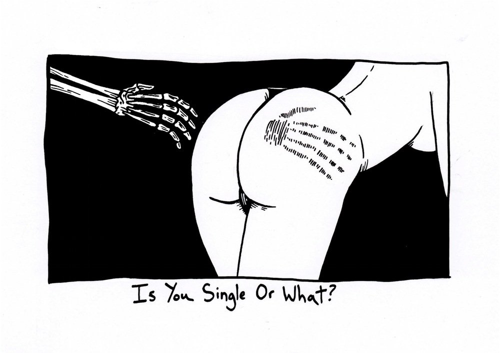
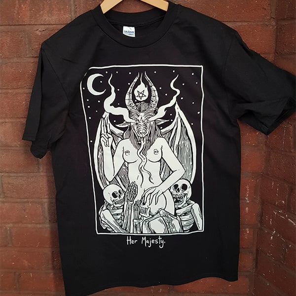
Matt Bailey is a UK based illustrator residing in London as a tattoo artist. His work often displays a simple ink drawing within a square box and caption underneath. His work exhibits medieval, tarot-card simplicity and darkness themes to them with a side of explicit and flavorsome material, not for the faint of heart.

Image result for matt bailey
Matt Bailey is an admitted and self-confessed voracious reader, thus has inspired his morbid fascination with mortality and occult. He is said to have taken a liking to Mike Mignola's Hellboy and Robert Ball's Winter Knight, other inspirations from Becky Cloonan's short comics. 
Image result for matt bailey illustration 
Something else that has attracted a wider audience is Bailey's more political pieces which convey personal opinions and views towards some of the most recent events regarding a change in power or a distaste towards certain groups. Because a couple of his pieces exhibit mutilation and harm there has been mixed opinions and general criticism that coming from audiences with conflicting views, which luckily have not stopped him from working his magic.


Image result for matt bailey illustration trumpImage result for matt bailey illustration trump

Bailey profits his work by selling merchandise on his store and by making turning his work in to eye-catching works of art on skin at Parliament Tattoo studio in London.

Image result for matt bailey illustration merch  Image result for matt bailey illustration tattoo
Share:

Wednesday, 14 February 2018

Contextual Studies - Evaluation and SWOT


Contextual Studies has been another difficult one for me, having to detail research in to trends dating as far back as the 1800's. Unlike my normal write-ups where it is much more relaxed and I can write from a personal level, I had to had to make in-depth research of 2500 words, complete with a bibliography detailing all my sources from an array of different formats online and in books.

Image result for history of poster design timeline


Whilst I got off to a good start expanding on the history of poster crazes from eras such as Art Nouveau, Early Modernism, Futurism, Heroic Realism, Kitsch, Late Modern, Psychedelic and more all the way up to Early Grunge. I started to lose my way when the deadline drew closer and began babbling after my introduction.

When hand-in was originally due I almost handed in an extremely half-assed looking essay which very obviously displayed my scatterbrained and sleepless night trying to reach the word count. I was very lucky to receive an extra week to re-write and re-evaluate.

After stepping away, receiving feedback and getting a grip I decided to make points and justification for them. I began to write with a bit more structure and depth and used research to inform a wider practice from a historical point of view. Whilst I have detailed key influences that have had an impact on commercial illustration I feel as though I left out certain points from contemporary viewpoints.

When I went on to talk about how the evolution of technology and political awareness had impacted modern practitioners work I found myself doing most of my research on established processes and practices opposed to what is happening in the current day. I struggled to expand on my research to a contemporary point of view which was really my downfall throughout this unit. My conclusion was spotty at best, showing very little focus again.

Lastly, whilst my bibliography was in good order, I did not take my investigation any further than the internet, showing only online sources where I could have expanded my research in to Juxtapoz and Digital Arts which have a selection of publications detailing emerging artists and techniques of this year from a more professional and well-credited source.

SWOT

Strengths:
  • In-depth research in an area out of my understanding
  • Correct and accurate bibliography
  • Detail to grammar and punctuation
  • Establishing key influences
  • Justifying my argument
Weaknesses:
  • Poor time management
  • Being too scatterbrained to think of where to start
  • Lots of waffle and babbling
  • Sources from anywhere other than the internet
  • Lack of contemporary viewpoints
Opportunities:
  • Making a timeplan and spending an hour a day doing coursework
  • Making a list bullet pointing key points
  • Use sources such as Juxtapoz and Digital Arts
  • Check in with tutor for help and advice
  • Look at tutorials on laying out essays
Threats:
  • Lack of sleep
  • Lack of motivation
  • Poor time management
Share:

Thursday, 1 February 2018

Compositing, Livetales and Contextual Studies - Smart Targets

Compositing:

  • RESEARCH (Collect and annotate examples of mixed media images and animations)
  • Note and consider the break down of processes used in mixed media examples
  • Moodboard (Detail influences and interests based on the final concepts you have considered)
  • THREE final concepts 

Livetales:

  • Reflect on feedback given and use it to adapt your idea and realize and refine your idea

Contextual Studies:

  • Look closer at structuring and drafting your essay (writing and structuring)
  • Decide what you will be researching based on what you are interested in
Share:

Wednesday, 17 January 2018

Digital Skills Application - Evaluation and SWOT


This unit was Digital Skill Application and I was left feeling rather disappointed with the pieces I had to present. 

This module took me up to about two weeks to really get a move on with and I felt very scatterbrained to settle on styles, approaches and workflows to how to get through my what I had. I feel as though my concentration and focus began to slip over the christmas period and and I began to fall off of my timeplan.


I feel like was very ambitious to challenge myself in an area I hadn't done before such as working traditionally, gathering and making a texture gallery however there are certain aspects of of my work that took longer than what it should have which made the digital side of my pieces appear rather rushed and lacklustre.


Whilst my sketchbook detailed problem solving and creative solutions to my how I was going to address issues in my assets I feel as though the final pieces varied in success via the individual panels. For example I feel like certain panels such as the last one appeared quite lazy and a bit of a rush job in comparison to the room which displayed a good sense of light and colour. If I had applied the same level of detail I did to the rest of the panels it would have been very easy sailing. Another point to make is the background which was just empty and boring, where it could have done with a bit of subtle pattern work to make it appear more interesting yet not eye-catching enough to distract from the main body of my work which was the separate panels of my work.


I did plan for my piece to be done in monotone I am very happy I chose to work using colours because there is more depth and an overall more established appeal about it. 


Although I really like the turn out of the scenery in the first page I feel there is a certain laziness about the decisions I made, especially regarding the grass which was made using the grass brush tool. It appears very obvious and very repetitively used making my pieces appear very unprofessional. Another point to make is my use of point-perspective when making the house is lacking the skill required, making it appear very wonky to say the least. I feel quite happy to say that whilst this was an issue I struggled with, I managed to overcome it the easy way, using assets to hide the areas for improvement.


To end on a happier note I feel fairly happy with the colour palettes which have informed research through artist influences and use of complimentary colours. Which backs up my point about being happy with my choice not to go with monotone colours.


I would like to use this unit as a learning point for briefs to come in the future and take some time to reflect upon my effort, motivation and the result of later work.

SWOT

Strengths:
  • Good standard of development and experimentation
  • Very good research in to artists
  • Informed development via research
  • Strong influences via research
  • Good decision making
Weaknesses:
  • Lazy documentation
  • Lack of skill when it comes to point-perspective
  • Limited texture gallery
  • Certain lazy aspects (grass brush)
  • Bad time management
Opportunities:
  • Spending an hour a day to do coursework
  • Learn more on point-perspective through tutorials
  • Collect free textures and magazine clippings to build texture gallery
  • Stop taking the easy way out
  • Make a realistic and achievable timeplan
Threats:
  • Leaving work until the last minute
  • Refusal to learn
  • Time management
  • Letting distractions get in the way of your focus
  • Not putting in the required effort of a HE student

Share:

Thursday, 11 January 2018

Artist Research - Junji Ito

Image result for junji ito


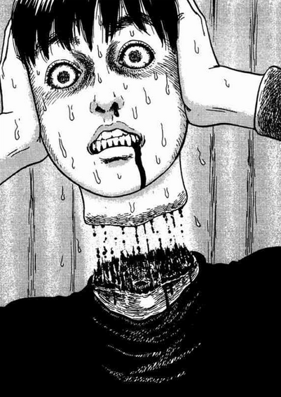
Junji Ito is a Japanese horror manga artist who has written and illustrated popular work such as The Enigma of Amigara Fault, Shiver, Uzumaki and Gyo.

From a young age Ito was inspired by both his older sister's drawing and the work of Kazuo Umezu. He first began elaborating his skills in drawing and writing as a hobby whilst working as a dental technician in the early 90's. In the late 1980's Ito submitted a short story to the Gekkan Halloween competition that won an honorable mention in the Kazuo Umezu Prize, this story was later serialized as Tomie.
Image result for junji ito

Ito was known to have many influences among his work from the likes of Hideshi Hino, Shinichi Koga and even the writings of H.P Lovecraft. Often showing interest in dark and creepy depicts of fiction. In many of his pieces his characters often find themselves to become victims of malevolent and unnatural circumstances for no discernible reason or in some cases to be punished.

Image result for junji ito

One of the more reoccurring themes in Ito's work include body horror, often displaying more graphic visuals with hair-raising carnage. When creating his pieces, Ito like many like-minded creatives starts by planning, sketching and annotating ideas on paper. A lot of his work is done traditionally using tools such as inks, brush pens and fineliners to make his work. When in the making, Ito likes to keep reference imagery above him as he works so the level of detail in his work is accurate.


Manga author Junji Ito in his studio, 2007 from Bharath M. on Vimeo.
Share:

Thursday, 16 November 2017

Juxtapoz Magazine - Review


Juxtapoz is a magazine that features an array of different genres and art types including; contemporary art, street art, graffiti, illustrative and even old master paintings. The magazine is made by people who enjoy creating art themselves and the editors have a sharp eye for quality so it's not another "anything can be art" experience. It really brings out the underground movement of the modern graffiti pop street-art you see today amongst many other mediums.

Looking through content I was enticed by some of the work of the featured artists. One of those artists being Matthew Palladino, an artist that works with painting and relief sculpture to present pop-looking three dimensional designs that regularly parody reality in content and medium. In the early years of his career during high school he was very engaged with graffiti and spray paints, creating simplistic character design such as devils, angels and sad sack faces. Although his graffiti concepts come across as quite basic I enjoy his choice of colour palette and characters.

Later throughout his career he picked up a fondness for watercolour painting where he experimented with traditional painting. He states that he has never been one for brush strokes, realistic rendering and acrylic painting but watercolour was a different story. I personally have to say that I am very keen on a lot of his watercolour pieces. The colours, themes and composition of his pieces are attractive to my tastes.


When Palladino had reached the limit of what he could do with watercolours he began to introduce fresh new mediums to experiment with such as plaster reliefs. When he started to feel like his paintings were looking flat he was eager to start bringing more form and volume to his work and started off by applying bits and pieces to his work from costumes stores and knick-knack shops to create collages. He experimented with other techniques as well such as mold-making but realised later down the road that it would be an expensive and time consuming process. He settled on plaster reliefs after experimenting with pre-made chocolate molds.


I personally find some of his molds pretty amusing and humorous. I can definitely applaud his workflow and endless efforts of experimenting but I don't think I could really find plaster relief that attractive.

Another artist that has drawn my attention is Edgar Flores, also known as Saner. A painter, street artist and illustrator who demonstrates his broad skill set particularly revolving around the theme of combining contemporary Mexican and ancient Aztec representations of local history and folklore. The subject matter almost always showcasing his awe-inspiring masks. Saner works with graphic design and applies digital techniques to his work. His digital pieces are honestly majestic and mind-blowing; the colours, style and overall appeal of the piece is stunning.


As well as graphics, Saner also has experience in traditional methods including acrylic on canvas. The style and colours are a lot more washed out with his traditional pieces but nonetheless stimulate an alluring sense of artistry - his composition, ideas and concepts are very unique.


Lastly I looked closely at Saner's wall murals, which once again are worked with acrylics. He works very closely with acrylic paints displaying his in-depth knowledge as such, I think compared to Palladino he is more settled on one medium. His designs are totally abstract and brings fresh Mexican visuals that waver between graphic design, graffiti, painting and drawing.


The final featured artist that caught my eye was the work of Adam Neate - known for his on-going series Dimensionalism, his successful practice where he demonstrates vibrant colours fused and altered around image form. As well as being a well-known street artists across and working with spray cans, aerosols and found objects, he also works with traditional paint.

His abstract and psychedelic looking pieces feature three-dimensional qualities as he works with (much similar to that of Palladino) scrap pieces of materials. Often layering these materials to make figurative images, including self-portraits and portraits of friends.


As well as these unusual and abstract pieces, Neate also has experience in traditional painting. Still as eccentric as his dimensional work but with more of a conventional and established appeal. He once stated that he goes out of his way to avoid painting on canvas, taking to carboard, walls and more to avoid the costly drawback of canvas. I definitely feel like his Dimensionalism series is some hilariously abstract stuff. Most if not all of his bizarre demeanours I've taken interest in for their surreal looking concepts. I can't say I've seen art like his before which makes him stand out of the crowd. I love it but I hate it.


I think the publication of artists like these is really great exposure and brings out just how abstract pieces of work can be conveyed and mean something deeper than it looks. I have always had conflicted views of the way social media affects artists, maybe because whilst some are very strict about how they enforce what is art, Juxtapoz exposes the movement behind painters and street artists alike.

Share:

Wednesday, 15 November 2017

Character Design and Alternative Techniques - Smart Targets

Character Design

I think there are definitely skills I would like to look back on, improve and reflect upon in future projects to come, such as:
  • Time keeping - Had I arranged my workflow and schedule better I could have avoided the rush to finish and make it look a little more worth while.
  • Reading the brief - I could have avoided such a hassle with my work had I properly read, highlighted and understood every aspect of my task.
  • Organisation - In future I would like to start organising myself better to appear more like that of a HE student.
Alternative Techniques

  • Thorough documentation - Because this unit was very experimental based and there wasn't much of a final piece it is very important to show I have an in-depth understanding of the workshops.
  • Workflow - My workflow did appear quite spotty and lacklustre throughout this project. I could have improved with a better understanding of my workflow and what managing what needed done first.
  • Confidence - I think speaking in front of peers is quite difficult for me, I speak too fast or don't go in to the details I wish I could out of nerves. I could benefit a lot from practicing speaking in front of people I trust.
Share: